Wednesday, June 18, 2014

London


London is our last stop before heading home. We have visited here before and so we decided with out limited time to visit a couple of our favorite spots; the Victoria and Albert museum and Covent Garden. The museum because it has an eclectic assemblage of stuff and always has some unusual special showing and because it is close by and free, and Covent Garden because it is a quaint shopping area with smaller shops focused on generally unusual items.


one of the standard symbols of London; the red double deck bus. we never ventured far enough from our hotel to use one of these they seemed to be plentiful, even to the point of double decking at some stops. (I thought that was rather funny but I may be alone with that thought based on local reaction)


The Victoria and Albert museum has this imposing front. The V&A as it is fondly called by locals dates back to 1852 and is named in honor of Queen Victoria and Prince Albert.  The building covers about 13 acres and houses around 5 million exhibits. It deserves more than a cursory walk through and so we opted to visit just a couple of the galleries.


In the main entrance hangs this giant Chihuli glass chandelier. It is over 10' tall and is comprised of Chihuli's trademark, the twisted multicolored glass tapered tubes.  Spectacular i this setting and I am afraid my photo does not do it justice.

First floor galleries are mainly antique sculptures and icons. the spacious setting allows 360 degree viewing; this is a setting other museums we have visited could learn from.

Church sculptures like this gilded altar piece are prominent in the displays

the Egypt ian section includes several sarcophagus and other burial items along with these two towering columns which were engraved with pictograms of a king's adventures and conquests. I guess there is no limit to what you can do if you are a god-king

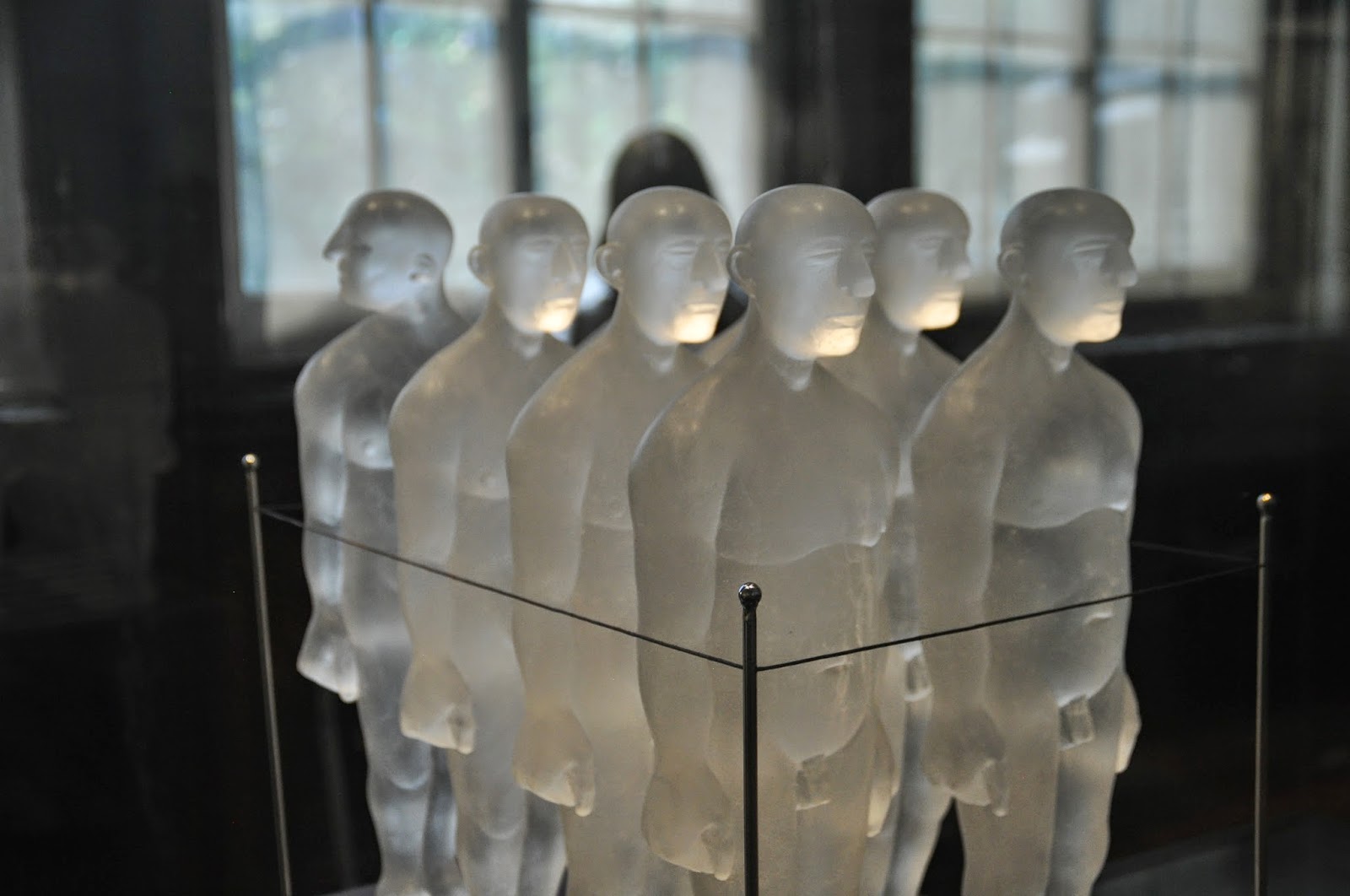
Upstairs in the special glass exhibit the display included several modern glass sculptures

This one was comprised of thousands of  thin glass rods that had been fused into this multicolored wave.

Another was this assemblage of glass blocks. this was labeled "DNA" and guess it could represent the results of coding.

I am particularly fond of this sculpture. it is about 2' tall. No title provided but I would label it "a distraction"

in addition to the glass exhibit there were a couple of rooms dedicated to the 1920's. This and the following signage show the advertising of that era.

Don't see much corn flour anymore.

Colman's mustard is still available in the familiar yellow tin. Somethings just should not change.

The beginning of  manufacturer directed customer interaction?

the 20's were a period of experimentation in design as this teapot demonstrates.

teapots must have been a "thing" in this era since the V&A has a large room dedicated to them. Row after row, each different but all serving the same function. Frank Lloyd Wright the advocate of form following function would be amazed at the variety of forms for the simple function of brewing and pouring tea. Teapots, teapots everywhere and not a drop to drink.

This reconstruction of a paneled room was to demonstrate the complex  marquetry that was evident in someof the high end houses of the era.

As a kid I would take a pile of 3x5 cards and draw stick figures on them which would appear to move when the cards were flipped in sequence.  I bet we all did this.  This device takes the card flipping to the nth level. inside the circular housing are probably over a thousand cards which when the handle was turned would display as a moving picture.

squashed musical instruments form the ceiling for this teaching and recital room.

This is nothing in particular. I just liked the lines and the reflected dome as an art composition. OK, for those of you who look for the meaning in these photos, you can view this as a metaphor for the museum -- a blending of new and old that combine to reflect the impact of the old on the new. 

The 24 hour clock in the lobby announces the hours.  In the background is a part of a wooden ceiling with royal symbols in marquetry.  I tried to get a full photo of it but could not find a location that permitted.

The interior courtyard is a delightful place to relax.  it has a pond which is labeled "no wading" Yep that will work with the children and sunshine.

Covent Garden is three rows of buildings containing small shops of both brand and no name goods.

Linda found a friend in front of the candy and tobacco store. I guess I need to get kilts to wear.

This group of Krishna followers were parading around the Garden and for a moment I was back in the 60's and 70's.  If you want to get the full effect of this I posted a short video on Facebook. I can't post movies on this blog site.

Even street musicians need some respite from their labor.

One of the dramatic contrasts I found this trip is shown in these last pictures.  relics of the  era that included servants as an integral part of some wealthy households can still be found on entrance gates leading to some houses. This gate was for servants and tradesmen only.


Move into the twenty first century and we have these internet phone booths at which anyone with a few quid and a computer can log in and conduct whatever business they need.  the times have indeed changed.

No comments:

Post a Comment